Sunday, September 22, 2013

5th year anniversary card

My husband and I just celebrated our 5th year wedding anniversary and, naturally, I made a card for my dear husband.

In case you may not know, the 5th year wedding anniversary gift is wood which signifies strength, solidity, and warmth. I didn't gift my husband an actual piece of wood but I created this card to resemble wood.


 I used the card sketch below from June's Mojo Monday.

MOJO296
 Supplies Used:
  • cardstock: early espresso, whisper white, bermuda bay, pistachio pudding, crumb cake
  •  stamps: memorable moments
  • inks: early espresso, crumb cake, bermuda bay
  • thanksgiving tablescape kit (background paper)
  • punches: 2 1/2" circle, 1 3/4" circle, heart
  • woodgrain embossing folder
  • paper piercing mat & paper piercer
  •  neutrals candy dots

View & shop for your Stampin' UP! supplies at my online store located on the left of this page. 

Until next time.... 
Sunday, September 15, 2013

His & Hers birthday cards

September stamp club was super fun! I sure hope my gals enjoyed their projects as we put together a His and Hers birthday cards! They look like they're enjoying themselves, don't they??!!

 My card design was "cased" from one of this year's convention presentations. I knew I had to make one of these as soon as I could. Here's what Shelli featured at convention.


I decided to create a His & Hers birthday cards considering that I pretty much have a birthday every day this month plus there's always a birthday card to be made for someone, right?!

The awesome part about these cards is that when you open the top flap, the sentiment comes right out with it! Super COOL!

My TIPS:
  • cut your base cardstock to 4 1/4"x11" then score at 1 1/2"
     and 7".
  • use sticky strip on the edges of your card base to create the pocket as shown below.
  •   create the inside piece by cutting a 3 1/2"x3 1/4" piece of cardstock and scoring it to 1/4". 
  •  Adhere sticky strip above the score line.
  • Place the 3 1/2"x 3 1/4" piece of CS inside the pocket then fold top flap over the CS piece to adhere.

Supplies Used for "HER":
  • cardstock: crumb cake, crisp cantaloupe, summer starfruit, very vanilla, silver glimmer paper
  • DSP: birthday basics
  • inks: crisp cantaloupe
  •  stamp set: chalk talk, yippee-skipee!
  • punches: extra large oval, hexagon (to flag the ends), scallop edge border, itty bitty shapes
  • framelits: chalk talk
  •  My digital studio (for the bow)
  • polka dots embossing folder
  • black embossing powder 


 Supplies Used for "HIM": 
  • cardstock: crumb cake, whisper white, bermuda bay, gumball green,  basic gray
  •  inks: basic gray, gumball green, bermuda bay
  •  stamp set: morning post alphabet, memorable moments, dapper dad (retired)
  • punches: 1/2" circle
  • argyle embossing folder


 Thanks so much for stopping by. If you have any questions, feel free to e-mail me by clicking on the link on the left column.
Until next time....

Wednesday, September 11, 2013

Build a banner Blog HOP


Welcome to the Go Stamp It blog hop!
You are sure to love the creativity that this group of ladies bring to the crafting table (if you haven't already)! 
I am stop #5 in the blog hop and sure hope you enjoy what I have to show you.

For some reason, I had crafter's block this week and just couldn't get this banner situation worked out the way I wanted it so I had to resort to a simpler project.

I started off with dip-dye technique that was demonstrated by Stampin' UP's concept artist, Jen C. I was sure my banner was going to come out as beautiful as Jen's (below) but I was wrong.

Created by Stampin' UP! concept Artist, Jen C.


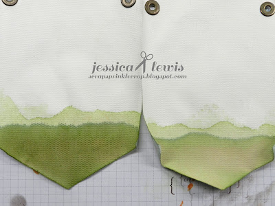
Dip-dye technique using water (tried to fix in the pic on the left, without fixing on the right)

On the first attempt I just couldn't figure out why my banners turned into an ugly brown and crinkled once it dried. After quite a while, I figured out that I used water instead of alcohol as my medium. DUH!!!
After figuring out that I needed to use alcohol, I created another set of banners using the dip-dye technique. Needless to say, I MUST be using the wrong ink because the same thing occurred......it dried to a light brown color. I tried covering it up by sponging some of the ink but it ended up looking worse. UGH!


 I kind of gave up and just said "heck with it!", but the thought of the ugly brown lingered in my head. Plus, I didn't think it was Blog Hop - worthy.

So once again, I'm at my crafting table coming up with a different option.

I wanted to create a fun and colorful banner for my son, Nathan's room. His room is Goofy (Disney) themed. So, I decided to resort to simply using the ink pads and markers.


Notice how  the outside edges of the banner are colored? I used the striped template from the build-a-banner kit as my guide.I then used the fine tip of  my marker to outline the circles and letters.

Finished project. Canvas frame painted by my dear friend Emily; Banner created by me.

I'm pretty happy with the turn-out of these banners but somewhat disappointed with the dip-dye fail =o(

Supplies used:
  • buil-a-banner kit (pg 31 of Holiday catalog)
  • markers: pear pizzaz, tangerine tango, chocolate chip, pacific point.
  • inks: pear pizzaz, tangerine tango, chocolate chip, pacific point.
  • sponge daubers

As I close, I do ask for your help and comment below on what I should try to make this dip-dye technique a success. Any suggestions???

Thanks for reading my post!! Up next, stop #6 with the lovely, talented, and wonderful DENISE SULLIVAN.
  1. Linda Shillingburghttp://lindasstamptherapy.wordpress.com/
  2. Sami Brown - http://samisstampinspot.blogspot.com
  3. Caren Curtis - http://creatingwithcaren.blogspot.com
  4. Ronna Powers - http://ronnaspaperplace.blogspot.com
  5. Jessica Lewis - http://scrapsprinklecrop.blogspot.com     <--- YOU ARE HERE
  6. Denise Sulllivan - http://gostampit.blogspot.com